Fabrizio Biora (MIZAR) and D. Pietrantonio (Comune di Torino)
CONTENTS
2 ANALYSIS OF THE LEEDS FIELD TRIAL
2.1 INTRODUCTION
2.2 BUS TRAVEL TIMES AND DELAY
2.2.1 Data collected
2.2.2 Results
2.2.3 Conclusions
2.3.1 Data collected
2.3.2 Results
2.3.3 Conclusions
2.4 CONFLICT STUDIES
2.4.1 Data collected
2.4.2 Results
2.4.3 Conclusions
2.5 PEDESTRIAN DELAY
2.5.1 Data collected
2.5.2 Results
2.5.3 Conclusions
2.6 SPEED PROFILES
2.6.1 Data collected
2.6.2 Results
2.6.3 Conclusions
2.7 QUEUE SURVEYS
2.7.1 Data collected
2.7.2 Results
2.7.3 Conclusions
2.8 COMPARISON WITH THE SIMULATION RESULTS
3 ANALYSIS OF THE TURIN FIELD TRIAL
3.1INTRODUCTION
3.2 TRAFFIC SCENARIO
3.3 CYCLE TIMES
3.3.1 Data collected
3.3.2 Results
3.3.3 Conclusions
3.4 AR JOURNEY TIMES
3.4.1 Data collected
3.4.2Results
3.4.3 Conclusions
3.5.1 Data collected
3.5.2 Results
3.5.3 Conclusions
3.6 STOPS
3.6.1 Data collected
3.6.2 Results
3.6.3 Conclusions
3.7 QUEUES
3.7.1 Data collected
3.7.2 Results
3.7.3 Conclusions
3.8 COMPARISON WITH THE SIMULATION RESULTS
APPENDIX A: ANALYSIS OF LEEDS MOVING OBSERVER TRAVEL TIME DATA
APPENDIX B: TABLE OF LINK TRAVEL TIMES
APPENDIX C: TABLE OF PERCENTAGE CHANGES ON LINK JOURNEY TIME FOR BUSES OF SERVICE 2
The trials used networks operating under the following conditions:
(a) Baseline conditions, Leeds and Turin
(b) SPOT operating alone, Leeds
(c) SPOT operating with the strategies devised for PRIMAVERA, Leeds and Turin
(d) SCOOT operating alone, Leeds
(e) SCOOT operating with the strategies devised for PRIMAVERA, Leeds
The strategies for each city are as follows:
Leeds
SCOOT - Starting and stopping waves, bus priority and speed advice.
SPOT - Horizontal queue model, bus priority and speed advice.
Details of the analysis of the Leeds results are given in Section 2. The initial analysis of the data highlighted a problem. It became apparent that the sample sizes in the conflict studies were not large enough to give statistically significant results. Additional funding was requested to collect more data, but this was not forthcoming. Therefore no conclusions can be drawn from the field trials about any changes in safety due to the implementation of the strategies.
The main improvements deduced due to adoption of the PRIMAVERA strategies in Leeds are:
SPOT - Cooperative auto-gating and speed advice.
Positive results on all the measured indicators have been obtained. Details of the analysis are given in Section 3. Section 3.1 presents an introduction to the field trials. A summary of the cases tested is given together with assumptions and references for the rest of the document. Sections 3.2 to 3.7 report the analysis of the data collected. Section 3.8 contains a comparison between the simulation and field trial results for the implemented strategy. Improvements produced from the adoption of the control strategy devised for PRIMAVERA in Turin can be summarised as follows:
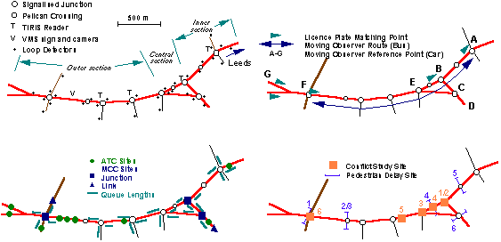
Figure 2.1: The Dewsbury Road Trial Site
The Leeds field trial site and the data collection points are shown in Figure 2.1. The urban arterial chosen for the field trial in Leeds was a 3km section of the A653; the Dewsbury Road. This is one of the main radial routes into Leeds, carrying approximately 23,000 vehicles per day. It is also a heavily used public transport corridor, peak flows being in excess of 36 buses per hour. It is typical of many urban arterials in that it attempts to combine the functions of general traffic movement, public transport corridor, shopping street and residential area. On the chosen section there are ten signalised intersections including three pelican crossings. In terms of physical characteristics Dewsbury Road can be divided into three distinct parts. The outer section comprises largely a four lane carriageway with closely spaced pedestrian refuges, so that it is almost a dual carriageway. Fronting the road is a mixture of light industrial and residential uses. The central section passes through a local shopping centre with shops on both sides of the road. This part of Dewsbury Road comprises two traffic lanes with localised widening to three lanes at the two signal controlled junctions. The inner section, closest to the city centre, is made up of three lanes with one lane for city bound traffic and two lanes outbound, one which is reserved as an evening peak bus lane.
Six types of survey were carried out as follows:
Four of the major bus operators; Yorkshire Rider, Yorkshire Buses, Yorkshire Traction and West Riding Buses, equipped a total of 300 of their buses with transponders. The surveys during the field trials indicate that this resulted in approximately 65% of the buses using the Dewsbury Road being equipped.
Total bus journey times were measured by moving observers on buses. These times were measured for both inbound and outbound journeys over the Dewsbury Road trial site. Data was collected during both the morning and evening peaks.
| Strategy | No of matches | Journey Time (seconds) | s.d. | % change in time | % confidence |
|---|---|---|---|---|---|
| Baseline | 87 | 406 | 87 | ||
| SPOT + | 52 | 382 | 84 | -5.9 | 89 |
| SPOT alone | 48 | 455 | 118 | 12.1 | 99 |
| SCOOT + | 46 | 407 | 95 | 0.2 | 5 |
| SCOOT alone | 45 | 431 | 113 | 6.2 | 80 |
The first point to note is that the use of both SCOOT and SPOT on their own without the bus priority or traffic calming components increases bus travel times. This is because on this arterial the UTC systems impose strong co-ordination (green waves) for cars between the signals. Buses travel at different speeds to cars and therefore can drop out of this co-ordination. The bus journey time variability, as indicated by the standard deviation, also increases when the UTC systems are used on their own.
The introduction of the integrated strategies appears to reduce bus travel times back to baseline values when used with SCOOT and improves on the baseline values when used with SPOT. When comparing the integrated strategies against the UTC systems on their own, the integrated SPOT based strategy reduces the travel time by 16% when compared with SPOT alone, with virtually 100% confidence of a statistically significant change. The integrated SCOOT based strategy reduces the travel time by 6% with 72% confidence.
The number plate matching surveys do not distinguish between transponder equipped and non-equipped buses, for this the moving observer surveys need to be examined. The results for the entire bus fleet are shown in Table 2.2.
                     Inbound am   Outbound am    Inbound pm   Outbound pm

                        Time          Time          Time          Time

Baseline

Number of Trips          35            32            26            29

Mean Time               377           353           322           357

s.d.                     86            79            98            74


SPOT

Number of Trips          38            37            41            36

Mean Time               413           345           311           356

s.d.                    114            56            73            86

% change in time        9.5          -2.3          -3.4          -0.3

% confidence             87            37            40             4


Integrated SPOT

Number of Trips          27            27            41            40

Mean Time               371           326           282           334

s.d.                     88            47            69            77

% change in time       -1.6          -7.6         -12.4          -6.4

% confidence             21            89            92            78


SCOOT

Number of Trips           9             7             9             8

Mean Time               379           393           319           371

s.d.                     58            69            47            43

% change in time        0.6          11.3          -0.9           3.9

% confidence              5            78            10            39


Integrated SCOOT

Number of Trips          15            16            25            25

Mean Time               339           365           327           371

s.d.                     80           100            67            76

% change in time       -9.9           3.4           1.4           3.9

% confidence             85            35            17            50
Table 2.2: Changes in bus travel time (Moving Observers)
The priority system only gives priority to transponder fitted buses travelling inbound. Table 2.3 shows the results for these equipped buses in this direction when the integrated strategies with bus priority are in operation.
                     Inbound am    Inbound pm

                        Time          Time

Integrated SPOT

Number of Trips          21            25

Mean Time               348           290

s.d.                     81            52

% change in time       -7.7          -9.9

% confidence             78            85


Integrated SCOOT

Number of Trips          11            12

Mean Time               348           331

s.d.                     87            63

% change in time       -7.7           2.8

% confidence             66            23
Table 2.3: Changes in bus travel time (Transponder fitted buses)
The moving observer results indicate that during the AM peak both the SPOT and SCOOT based integrated strategies manage to reduce bus journey times for inbound buses by about 8% for the transponder equipped buses, when compared with the baseline.
The moving observer surveys also indicate that the integrated strategies reduce travel times for outbound buses during the AM peak, when compared to the UTC systems on their own. In the PM peak SPOT alone reduces travel times by 3.4% inbound with little change to outbound travel times. The integrated SPOT based strategy reduces inbound travel times by 12.4% and the outbound travel times by 6.4%. SCOOT is not helpful to buses during the PM peak, making little difference to inbound travel times and increasing outbound travel times by 3.9%, whether operating alone or with the integrated components.
Approximate total travel time savings for introducing the integrated components into the UTC systems are shown in Table 2.4. These are based on bus patronage figures during the two hour peaks and the moving observer travel time surveys.
                         AM Peak               PM Peak

                    Inbound   Outbound    Inbound    Outbound


Patronage            1700       800         1200       1500


Integrated SPOT

Time saving (s)        42        19           29         22

Total saving (s)    71400     15200        34800      33000


Integrated SCOOT

Time saving (s)        40        28           -8          0

Total saving (s)    68000     22400        -9600          0
Table 2.4: Total bus travel time savings
The integrated SPOT based strategy produced a reduction in both bus journey times and journey time variability according to both the number plate matching and the moving observer surveys.
In addition a registration plate survey was undertaken between 0730 and 0930 using five timing points on the Dewsbury Road, inbound towards the city centre, on one day for each condition. The timing points can be seen in Figure 2.1. Unfortunately, a communications link failed on the day of the survey for the integrated SPOT strategy, which invalidated the results.
Figure 2.2: The Journey Time route links
Table 2.5 shows the changes in travel time on each link within these
moving observer routes. The travel times for each of the integrated strategies
is compared with the travel time for the UTC system operating without the
integrated components. Therefore the integrated SCOOT strategy is compared
against SCOOT without the starting and stopping wave, bus priority and
traffic calming components. The integrated SPOT strategy is likewise compared
against SPOT without the horizontal queue model, bus priority and traffic
calming components
The typical flows on each link during the two hour peak periods are also shown. These have been used to calculate the overall change in travel time for all the vehicles using the network covered by the moving observers. These changes in overall network time are given below the main table.
                         AM Peak      AM Peak                     PM Peak      PM Peak

                       % change in  % change in                 % change in  % change in

     Length  AM Peak   Travel Time  Travel Time       PM Peak   Travel Time  Travel Time

      (m)      Flow      SPOT +       SCOOT +           Flow      SPOT +       SCOOT +

 Link

  1     288      1200        -0.82         3.92           1400        -6.70         9.06

  2     235      1200       -16.84        -0.19           1400        -7.00        15.67

  3     153      1200       -22.26         3.18           1300        -3.14       -12.29

  4     204      1200         8.12        -9.97           1300         4.84        -7.62

  5     401      1200         2.26        -5.75           2000        -0.98         3.47

  6     395      1200         5.92        -7.35           2150        -4.23         1.06

  7     193      1200        -9.06        -7.27           2150        -9.33         5.83

  8     493      1200        -1.39         8.59           2100        13.81        54.28

  9     246      1350       -11.43         7.12           1550        -8.58         5.31

 10     451       800         8.44         5.70            800         1.17         7.84

 11     552      1250       -22.79        22.48            800       -41.54        99.34

 12     507      2200        11.86        -1.79           1900         3.90        12.29

 13     180      2200        24.85        13.25           2100       -16.90        -4.50

 14     390      2200         4.49         5.10           2100         1.45        10.97

 15     405      2200        11.22         6.02           2500         1.79       -16.68

 16     492       700        -0.18        -6.47           1050         9.24       -10.18

 17     189      2000        -6.90         2.16           2500         3.30        23.94

 18     231      2000         1.09         4.59           2500         2.99        -2.71

 19     187      2000        -6.23         9.64           1400         6.35        81.44

 20     256       900        29.86        34.60            700         6.42       -30.36

 21     248      1700        18.12        -2.95           1200        12.91       -14.73

 22     290      1700       -10.26        -9.54           1200         5.44        36.93

 23     127      1600        -6.90        -3.78           1450        16.03       -24.30

 24     226      1600       -13.37        18.34           1450        30.51        -6.71

 25     208      1950        -8.48         4.79           1900        40.13       -22.60

 26     469       700         7.76        13.53           1000        37.77         8.07

 27     494      1100        23.65       -12.85           1000         7.19         2.07

 28     246       900        -8.81        22.24           1300         6.78        10.62

 29      67       800         2.82       -11.01            800        -3.59         2.25

             Network          3056        81343       Network        125755       136121

             change(s)                                change(s)
Table 2.5: The changes in travel times for each link
The total change in travel times for all vehicles travelling on these links, assuming a vehicle occupancy of 1.4 per vehicle is shown at the bottom of Table 2.5. For the AM Peak, these increases in car travel time are easily countered by the decrease in bus travel times in the same period. (See Table 2.4) For the PM Peak the increased car travel times exceed the bus travel time savings. The extra delay to cars during the PM Peak is probably a result of using the bus priority component. This component is only giving priority towards the city centre and during the PM Peak this is against the main traffic flow. The staging arrangements at some of the bus priority junctions means that extending green times for buses inbound can result in an increase in red time for vehicles travelling outbound. It is therefore recommended that the bus priority component is not used during the PM Peak.
(1) Integrated SPOT based strategy (week beginning 25th of July 1994)
(2) Baseline studies (week beginning 1st of August 1994)
(3) Integrated SCOOT based strategy (week beginning 25th of October 1994)
| Conflict Type | Vehicle-Vehicle | Vehicle-Pedestrian | Total |
|---|---|---|---|
| Serious conflicts | 2 | 1 | 3 |
| Border line cases | 1 | 0 | 1 |
| Slight conflicts | 11 | 11 | 22 |
| Total | 14 | 12 | 26 |
(b) Baseline conditions
| Conflict Type | Vehicle-Vehicle | Vehicle-Pedestrian | Total |
|---|---|---|---|
| Serious conflicts | 1 | 1 | 2 |
| Border line cases | 1 | 2 | 3 |
| Slight conflicts | 2 | 5 | 7 |
| Total | 4 | 8 | 12 |
(c) Integrated SCOOT based strategy
| Conflict Type | Vehicle-Vehicle | Vehicle-Pedestrian | Total |
|---|---|---|---|
| Serious conflicts | 0 | 0 | 0 |
| Border line cases | 1 | 0 | 1 |
| Slight conflicts | 12 | 3 | 15 |
| Total | 13 | 3 | 16 |
Using the statistical procedures of Nicholson (1987)[1] but substituting days of observed conflicts instead of years of observed accidents, we can say with 95% confidence that there has been a significant change from the baseline rate if the total number of all conflicts is outside the range 3 to 21. Similarly if the total number of serious conflicts is greater than 5 we can say with 95% confidence that there has been a significant increase. Thus none of the observed changes were significant, except for the total number of conflicts under the SPOT based strategy.
Implementation                          Site Number

Baseline                  1        2/3        4         5          6

No. of pedestrians       379       206       719       241       451

Average Delay (s)      17.44     13.88     17.10     19.10      16.45


SPOT

No. of pedestrians       286       247       241       172        362

Average Delay (s)      28.08     11.22     28.11     27.72      28.67

Delta Average Delay    10.64     -2.66     11.01      8.62      12.22

% change               61.01     -19.17    64.37     45.11      74.25

% confidence             100        93       100       100        100


Integrated SPOT

No. of pedestrians       418       247       344       228        365

Average Delay (s)      31.91     11.63     34.18     35.17      25.29

Delta Average Delay    14.47     -2.26     17.08     16.07      8.84

% change               82.97     -16.25    99.90     84.11      53.74

% confidence             100        86       100       100        100


SCOOT

No. of pedestrians       437       249       404       237        314

Average Delay(s)       28.63     11.56     25.51     32.78      34.80

Delta Average Delay    11.19     -2.33      8.41     13.68      18.35

% change               64.17     -16.75    49.21     71.61     111.52

% confidence             100        88       100       100        100


Integrated SCOOT

No. of pedestrians       369       105       404       235        279

Average Delay (s)      23.91     16.46     24.92     24.73      30.72

Delta Average Delay     6.47      2.57      7.82      5.62      14.27

% change               37.08     18.54     45.73     29.44      86.72

% confidence             100        40       100       100        100
If the average pedestrian flows are used at each site, it is possible to estimate the total change in delay across the five sites. This is shown in the following table.
Table 2.10: Change in Total Pedestrian Delay
                                              Site No.

                          1         2/3         4          5          6        Total

Average flow             378        211        422        223        354        1588


SPOT

Delay change (s)        4020       -561       4650       1918       4327       14354


Integrated SPOT

Delay change (s)        5467       -476       7216       3577       3131       18915


SCOOT

Delay change (s)        4228       -490       3554       3045       6499       16836


Integrated SCOOT

Delay change (s)        2443        543       3303       1252       5054       12595
All the systems result in increase in total pedestrian delay. This is not surprising as the UTC systems make full use of the available road space, resulting in fewer gaps for pedestrians to cross the road. However, if these increases in pedestrian delay are compared with the savings in travel time from implementing the strategies at this trial site, the bus travel time savings are an order of magnitude larger than the increases in pedestrian delay.
The comparison between the UTC systems on their own and the integrated strategies is seen in Table 2.11.
                     Average   % change      %

                     change(s)           confidence


Integrated SPOT      +3.18      +12.7       100

Integrated SCOOT     -1.91       -7.1        97
Table 2.11: Changes in Pedestrian Delay
There is an increase in pedestrian delay when the integrated SPOT based strategy is compared against SPOT alone. There is a slight decrease for the integrated SCOOT based strategy.
It is interesting to note that the only site which shows any improvement in pedestrian delay is the one just downstream of the VMS.
Click here for Figure 2.3
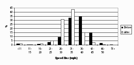
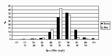
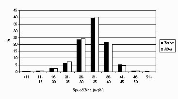
Figure 2.3: The location of the speed counters
The data presented here covers five complete days (24 hours) of data for a period before the installation compared with a corresponding five day period after the installation.
Click here for Figure 2.4
Figure 2.4: The Speed Profile at S12
Click here for Figure 2.5
Figure 2.5: The Speed Profile at S13
Click here for Figure 2.6
Figure 2.6: The Speed Profile at S14
The changes in the percentage of vehicles exceeding the speed limit,
the mean speed and standard deviation of the speed are shown in Table 2.12.
| % speeding | Mean Speed (mph) | % confidence in change in Mean Speed | Standard Deviation | ||||
|---|---|---|---|---|---|---|---|
| Site | Before | After | Before | After | Before | After | |
| S12 | 18 | 3 | 35.3 | 31.3 | 100.0 | 6.6 | 5.8 |
| S13 | 16 | 3 | 31.0 | 29.2 | 100.0 | 6.6 | 4.9 |
| S14 | 6 | 5 | 29.4 | 29.2 | 99.9 | 6.6 | 6.5 |
Due to the very large sample size, there is a very high confidence that the mean speed of vehicles approaching the pelican crossing has decreased. A recent TRL report (Finch et. al. 1994) has indicated that a 1 mph reduction in vehicle speeds can result in a 5% reduction in accident rates, therefore significant safety benefits are predicted for this site. There is even strong evidence that the influence of the VMS extends downstream beyond a pelican crossing as a small but statistically significant reduction in speed has been recorded here.
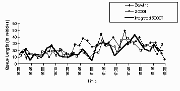
Click here for Figure 2.7
Figure 2.7: The queues at an approach to Beeston Ring Road junction
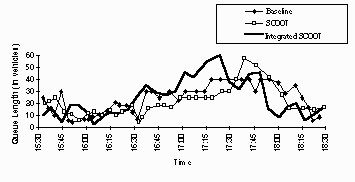
Click here for Figure 2.8
Figure 2.8: The queues at another approach to Beeston Ring Road junction
The average queues on each arm of the surveyed junctions during the
survey periods have been calculated. These have been added together to
give the total average queues on all arms of the junctions. The results
are presented in Tables 2.13 and 2.14. During the AM Peak, the integrated
SCOOT based strategy produces an increase of 8.4% in total queue length
when compared with SCOOT alone. The integrated SPOT based strategy increases
the total queue lengths by 11.7%. In terms of the extra visual intrusion
produced by this increase in queue lengths, this is approximately equivalent
to adding one extra car to the end of each queue during the peak period.
AM Peak             Baseline  SCOOT   SCOOT+   SPOT   SPOT+

Tommy Wass               66      62       69     83      95

Westland Road            21      17       21     19      18

Middleton Grove          12      17       22     15      25

Parkside / Garnet        32      37       36     35      31

Dewsbury / Tunstall      20      23       21     29      31

Hunslet Hall Road        20      16       24     26      29

Tunstall / Garnet        32      33       29     31      36


Total                   204     205      222    238     266

% change                                8.36          11.67
Table 2.13: The total average queues on all arms (AM Peak)
PM Peak             Baseline  SCOOT   SCOOT+   SPOT   SPOT+

Tommy Wass               86      77       88     91      82

Westland Road            16      17       25     19      16

Middleton Grove          13      20       20     17      28

Parkside / Garnet        37      35       38     29      36

Dewsbury / Tunstall      26      11       29     20      40

Hunslet Hall Road        23      14       19     14      16

Tunstall / Garnet        31      39       39     31      30


Total                   232     214      257    220     249

% change                               20.45          12.96
Table 2.14: The total average queues on all arms (PM Peak)
SPOT   Simulated   Actual             SCOOT   Simulated   Actual

Link   % change   % change             Link   % change   % change

    1        2.7      -0.8                 1       -0.8       3.9

    2        2.9     -16.8                 2       -9.9      -0.2

    3       -1.0     -22.3                 3       -8.3       3.2

    4       -2.8       8.1                 4        0.0     -10.0

    5       -4.6       2.3                 5       31.1      -5.8

    6       -3.1       5.9                 6       -1.8      -7.4

    7       -7.7      -9.1                 7       24.0      -7.3

    8       -2.0      -1.4                 8       11.3       8.6

    9       -1.8     -11.4                 9       10.3       7.1

   10        0.1       8.4                10        0.0       5.7

   11       -0.5     -22.8                11       11.2      22.5

   12        7.1      11.9                12      -12.4      -1.8

   13        3.4      24.9                13       -3.6      13.3

   14       -7.5       4.5                14       -2.5       5.1

   15      -10.6      11.2                15        0.0       6.0

   16       -6.4      -0.2                16        7.3      -6.5

   17       -0.2      -6.9                17        0.0       2.2

   19      -25.9      -6.2                19       18.3       9.6

   20        2.7      29.9                20        5.1      34.6

   21       -0.3      18.1                21        0.0      -3.0

   22       -1.0     -10.3                22        4.9      -9.5

   23       -3.2      -6.9                23        6.3      -3.8

   24        3.4     -13.4                24        0.2      18.3

   25        8.3      -8.5                25        2.0       4.8

   26       -0.3       7.8                26        9.2      13.5

   27       -0.9      23.7                27       -1.0     -12.9

   28        1.8      -8.8                28       43.2      22.2


Total       -4.2       0.1            Total         1.7       3.7

change                                change
Table 2.15: Simulated vs actual changes in travel times
As can be seen there is rarely agreement between the simulated and observed results. There are a number of reasons for this. Firstly there is the usual problem with field trials of not knowing whether the changes being measured are due entirely to the strategy or to some external influence such as the weather or fluctuations in demand. Similarly, simplifications had to be made to the network and signal plan representations in the simulations which could result in discrepancies. Secondly, the simulations highlighted some areas where problems could occur. With these in mind the systems implemented on-street were changed to try and reduce these problems. For example, the simulations revealed that when using SCOOT, constraining the whole area to an 88s upper limit on cycle time did not allow cars to benefit as much as possible. Therefore during the field trials the area was split into two regions, one with the 88s constraint the other without. The simulations and the field trials are thus comparing different systems. Overall, for the whole network, the SCOOT results show reasonable agreement, both showing a small increase in travel time. The SPOT results are not so good, the simulations predicting a reduction in travel time, the field trials showing little change.
The field trials have been designed to see whether improvements as predicted by simulations in Deliverable 12: "Evaluation of Simulated Strategies", occur in reality. Statistical tests have been carried out on the data collected during the field trials. These are used to produce confidence levels that the measured changes are real and not due simply to inherent variability of the data.
The trials in Torino cover the network operating under the following conditions:
SPOT+ = SPOT + Cooperative Auto-gating + Speed Advice
The strategy adopted is totally decentralised and no interventions have been allowed by the Area Level Control of the UTOPIA system in Torino. The Traffic Control Centre has been used merely for its monitoring functionality.
Field trials have covered the Corso Grosseto area. The test site includes
seven controlled intersections located along the Corso Grosseto arterial.
See Deliverable 4: "Description of the Test Sites" for a more detailed
description of the test site. For simplicity, in the rest of the document
the intersections are identified by a numeric index. The following table
shows the correspondence between the numeric code and the intersections,
the diagram below a schema of the topology of the network:
| Code | Intersection |
|---|---|
| 11 | Corso Grosseto - Via Casteldelfino |
| 12 | Corso Grosseto - Via Fea |
| 13 | Corso Grosseto - Via Bibiana |
| 14 | Corso Grosseto - Via Chiesa della Salute |
| 15 | Corso Grosseto - Via Ala di Stura |
| 16 | Corso Grosseto - Corso Vercelli - Via Botticelli |
| 17 | Corso Vercelli - Via Toscanini - Via Porpora |
Click here for Figure 3.1
Figure 3.1: The topology of the Corso Grosseto test site
The baseline surveys were carried out from September to October 1994 while the SPOT+ surveys were carried out in June 1995. Between the Baseline and SPOT+ surveys significant modifications to one link, connecting intersections 15 and 16, have been implemented. These modifications have narrowed the carriageway from 4 to 3 lanes in order to facilitate the entrance and the exit from the motorway going to the airport. The changes have resulted in heavy congestion on the link. The link has therefore not been considered in the evaluation of the benefits/disbenefits introduced by the system.
Results are presented for the AM and PM peak periods. Timings for the peaks are 7:00-9:30 for AM and 17:00-19:30 for PM.
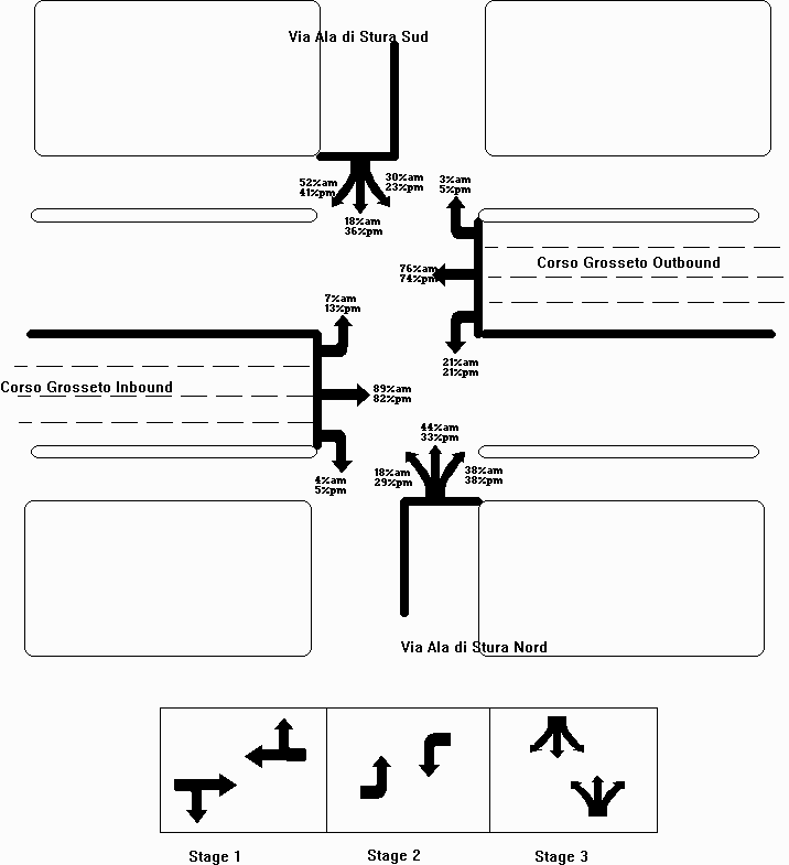
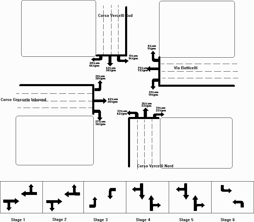
The following series of diagrams represent the topology, stage planning and turning movements for intersections 11, 15 and 16 where Manual Classified Counts took place. Intersections 12, 13, 14 have a topology very similar to intersection 11 and the same stage planning.
Click here for Figure 3.2.
Figure 3.2: Topology and stage planning for intersection 11
Click here for Figure 3.3.
Figure 3.3: Topology and stage planning for intersection 15
Click here for Figure 3.4.
Figure 3.4: Topology and stage planning for intersection 16
The MCC surveys also gave an indication about the traffic composition
on the arterial as summarised in the following table.
| Category | Percentage |
|---|---|
| Cars | 93.8 % |
| Lorries | 5.6 % |
| Heavy Goods Vehicles | 0.6 % |
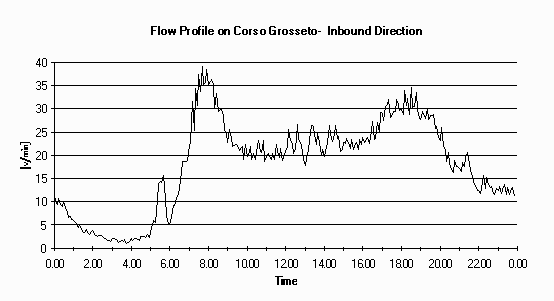
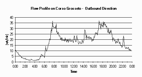
More than 30 ATC counters were deployed in the Corso Grosseto area. For each day the flow profile, sampled at 5 min. intervals has been recorded. The following diagrams show the typical flow profile on one inbound and one outbound section. From the diagrams the two peaks can be easily identified. In absolute terms the dominant flow in the AM peak is in the inbound direction while during the PM peak inbound and outbound flows are comparable.
Click here for Figure 3.5.
Figure 3.5: Flow profile on Corso Grosseto, inbound direction
Click here for Figure 3.6.
Figure 3.6: Flow profile on Corso Grosseto, outbound direction
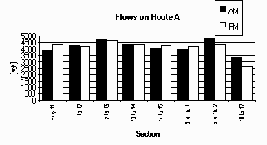
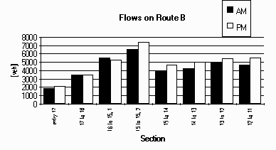
For the assessment of the control strategies flows on all the links are needed. The following table and figures show the flows on each link aggregated for the peak periods. Two detectors were placed on links 15-16 and 16-15, one just at the exit of the upstream junction and the other after the confluence of the motorway coming and going to the airport.
Flows on the side roads represent only a small percentage of the flow
on the arterial except for Via Botticelli and Corso Vercelli where they
are comparable. These two roads are arms of intersection 16 which is the
most saturated in the field trial area.
Link                  AM: 7:00-9:30  PM: 17:00-19:30

entry 11                  3882            4328

11 to 12                  4289            4175

12 to 13                  4717            4684

13 to 14                  4340            4353

14 to 15                  4021            4271

15 to 16, 1               3965            4188

15 to 16, 2               4769            4375

16 to 17                  3341            2659

exit 17                   2247            2337

entry 17                  1866            2101

17 to 16                  3434            3459

16 to 15, 1               5551            5290

15 to 15, 2               6576            7352

15 to 14                  3911            4678

14 to 13                  4222            4984

13 to 12                  4913            5410

12 to 11                  4683            5498

exit 11                   4628            5014

Via Casteldelfino         1423            1407

Via Fea                    448            821

Via Bibiana               1110            1270

Via Chiesa della Salute    590            994

Via Ala Nord               962            1523

Via Ala Sud               1248            1396

Corso Vercelli Sud        3572            3597

Via Botticelli            3909            3877

Via Toscanini             1509            1822

Via Porpora                826            1146
Table 3.3: Flows during the peaks on the links
Flows on the two routes, A and B, covered by the moving observers are now presented, along with the flows on the side roads.
Click here for Figure 3.7.
Figure 3.7: Flows on Route A, AM and PM peaks
Click here for Figure 3.8.
Figure 3.8: Flows on Route B, AM and PM peaks
Click here for Figure 3.9.
Figure 3.9: Flows on the side roads, AM and PM peaks
JUNCTION           11

Stage                 1       2       3        CYCLE

Baseline             45       16      29        90

SPOT+ AM Av.         69       18      26        113

SPOT+ PM Av.         67       18      31        116

SPOT+ AM St.Dev.     14       0       9         14

SPOT+ PM St.Dev.     14       0       9         16
Table 3.4: Cycle timings for intersection 11
JUNCTION           12

Stage                 1       2       3        CYCLE

Baseline             47       14      29        90

SPOT+ AM Av.         75       22      15        112

SPOT+ PM Av.         72       21      18        111

SPOT+ AM St.Dev.     12       6       2         14

SPOT+ PM St.Dev.     15       6       4         15
Table 3.5: Cycle timings for intersection 12
JUNCTION           13

Stage                 1       2       3        CYCLE

Baseline             47       16      29        90

SPOT+ AM Av.         65       15      33        113

SPOT+ PM Av.         62       15      36        113

SPOT+ AM St.Dev.     15       0       10        13

SPOT+ PM St.Dev.     22       0       9         21
Table 3.6: Cycle timings for intersection 13
JUNCTION           14

Stage                 1       2       3        CYCLE

Baseline             40       16      34        90

SPOT+ AM Av.         83       15      17        115

SPOT+ PM Av.         74       15      30        119

SPOT+ AM St.Dev.      8       0       5          7

SPOT+ PM St.Dev.     17       0       11        16
Table 3.7: Cycle timings for intersection 14
JUNCTION           15

Stage                 1       2       3        CYCLE

Baseline             49       16      25        90

SPOT+ AM Av.         66       26      19        111

SPOT+ PM Av.         59       29      28        117

SPOT+ AM St.Dev.     13       4       5         15

SPOT+ PM St.Dev.     13       2       9         15
Table 3.8: Cycle timings for intersection 15
JUNCTION           16

Stage                 1       2       3       4       5       6       CYCLE

Baseline             25       17      18      13      23      14       110

SPOT+ AM Av.         40       21      33      27      14      27       162

SPOT+ PM Av.         40       22      33      29      23      32       179

SPOT+ AM St.Dev.      3       8       2       3       8       4        13

SPOT+ PM St.Dev.      3       8       2       2       10      2        11
Table 3.9: Cycle timings for intersection 16
JUNCTION           17

Stage                 1       2       3        CYCLE

Baseline             20       49      41        110

SPOT+ AM Av.         15       28      46        89

SPOT+ PM Av.         17       40      45        112

SPOT+ AM St.Dev.      1       7       17        16

SPOT+ PM St.Dev.      4       13      16        22
Table 3.10: Cycle timings for intersection 17
D=sR2/2(s-q)C
where:
s: is the saturation flow
q: is the demand on the link
R: is the red length in the cycle
C: is the cycle length
The above formula is valid as long as (i) the distribution arrival pattern for the link is uniform and (ii) the degree of saturation is less than approximately 0.7. These conditions are valid for the side roads as (i) there are no other intersections close to the controlled ones and (ii) the degree of saturation on the side roads is low enough.
First an analysis of link journey time is presented. As described in the introduction journey times on link 15 to 16 have been excluded by the evaluation.
Besides significant reductions in journey time on most of the links, it should be noted that there is also a general reduction in the variability, shown by the reduction in the standard deviation of the distribution.
ROUTE         A

PERIOD        AM

              entry    11 to    12 to    13 to    14 to    15 to    16 to

              11       12       13       14       15       16       17

Baseline

Trips         50       50       50       50       50       n.a.     50

Time (s)      27       52       39       25       42       n.a.     45

s.d. (s)      14       20       16       17       22       n.a.     14

speed (km/h)  27       21.5     12.8     24.5     21.6     n.a.     7.8


SPOT+

Trips         45        45       45       45       45       n.a.     65

Time (s)      25        32       20       18       40       n.a.     32

% change      -5       -39      -48      -27       -6               -30

confidence    47       100      100       98       34                100

s.d. (s)      17       12       13       10       22       n.a.     21

speed (km/h)  28.6     35.5     24.7     33.7     23       n.a.     11.1
Table 3.11: Journey time on the links, Route A AM
ROUTE         A

PERIOD        PM

              entry    11 to    12 to    13 to    14 to    15 to    16 to

              11       12       13       14       15       16       17

Baseline

Trips         50       50       50       50       50       n.a.     50

Time (s)      25       57       42       31       40       n.a.     61

s.d. (s)      12       19       19       20       25       n.a.     38

speed (km/h)  29.4     19.7     12       19.9     122.7    n.a.     5.8

SPOT+

Trips         32       32       32       32       32       n.a.     50

Time (s)      20       39       27       17       39       n.a.     36

% change     -20      -32      -34      -46       -5               -41

confidence    90       100      100      100      15                10

s.d. (s)      15       16       13       4        19       n.a.     18

speed (km/h)  36.5     29       18.3     37       23.8     n.a.     9.8
Table 3.12: Journey time on the links, Route A PM
ROUTE         B

PERIOD        AM

              entry    17 to    16 to    15 to    14 to    13 to    12 to

              17       16       15       14       13       12       11

Baseline

Trips         50       50       50       50       50       50       50

Time (s)      55       128      69       42       46       43       44

s.d. (s)      18       65       29       28       23       18       29

speed (km/h)  11       2.7      42.1     21.7     13.3     11.7     25.4


SPOT+

Trips         65       45       82       45       45       45       45

Time (s)      62       138      75       34       21       13       35

% change      13        8        9      -21      -55      -69      -21

confidence    85       55       81       91       100      100      94

s.d. (s)      33       63       23       16       14       5        16

speed (km/h)  9.8      2.5      38.7     27.3     29.8     38       31.8
Table 3.13: Journey time on the links, Route B AM
ROUTE         B

PERIOD        PM

              entry    17 to    16 to    15 to    14 to    13 to    12 to

              17       16       15       14       13       12       11

Baseline

Trips         50       50       50       50       50       50       50

Time (s)      100      159      66       50       49       48       32

s.d. (s)      18       60       23       34       24       17       10

speed (km/h)  6.1      2.2      44.1     18.4     12.4     10.5     34.7


SPOT+

Trips         50       50       65       32       32       32       32

Time (s)      59       156      79       33       25       21       34

% change     -41       -2       19      -34      -50      -56        6

confidence    100      19       100      100      100      100      51

s.d. (s)      27       62       20       16       18       10       14

speed (km/h)  10.3     2.2      37       27.8     24.8     23.6     32.7
Table 3.14: Journey time on the links, Route B PM
Route Journey Times
The following table shows the total route journey time for routes A
and B in the AM and PM peaks. In all the periods a significant reduction
in journey times has been found.
Case         Route A AM   Route B AM   Route A PM   Route B PM

Baseline (s)     231          428          255          504

SPOT+ (s)        167          379          177          407

% change         -28          -12          -31          -19
Table 3.15: Journey time on the routes
Click here for Figure 3.10.
Figure 3.10: Journey time on the routes
The results show how the new system improves coordination between intersections. Significant benefits can be found during both peaks on the two routes. Such a result due to the coordination on the arterial should have introduced additional delays on the side roads. The aim of the following section is to evaluate a travel time indicator of the controlled network that also consider the side roads.
Network Travel Time
The aim of this section is to produce a travel time indicator for the network. Travel time is defined as the journey time on the link multiplied by the flow travelling on the link during the observation period. An indicator has been calculated for each intersection and then aggregated across the network.The following tables report the intersection and network indicators. Please refer to Appendix B for a table containing the link travel times. Values are in vehicle seconds.
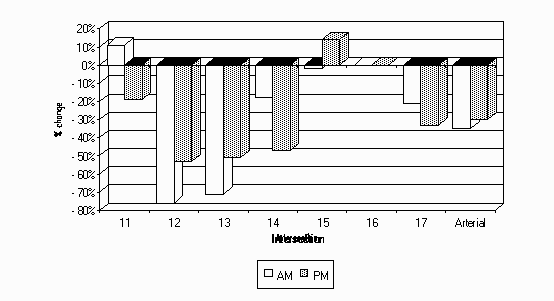
 Intersection      Baseline         SPOT+          % change

      11            361155          335222           -7.2

      12            448386          224493          -49.9

      13            417582          231184          -44.6

      14            291362          243011          -16.6

      15            702489          770377           9.6

      16            638746          737090           15.4

      17            341068          320183           -6.1

   Network         3200789         2861559          -10.6
Table 3.16: Travel time in the network, AM peak
 Intersection      Baseline         SPOT+          % change

      11            333310          342279           2.7

      12            523511          320563          -38.8

      13            485479          305781           -37

      14            396649          274885          -30.7

      15            707643          831559          17.51

      16            748688          817841           9.2

      17            488736          350454          -28.3

   Network         3684016         3243361          -11.9
Table 3.17: Travel time in the network, PM peak
Click here for Figure 3.11.
Figure 3.11: Travel time in the network, % changes
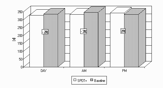
Hour        7     8     9    10    11    12    13    14    15    16    17    18    19    20    21    22    23

Base       336   361   340   360   310   318   332   330   330   350   355   323   324   322   341   329   330

SPOT+      336   336   330   325   328   322   320   323   323   327   333   351   342   329   324   316   314

% change  0.03 -6.84 -2.97 -9.70  6.04  1.38 -3.47 -2.15 -2.12 -6.49 -6.27  8.60  5.49  2.05 -5.01 -3.98 -4.84
Table 3.18: Bus Journey Time, Outbound direction
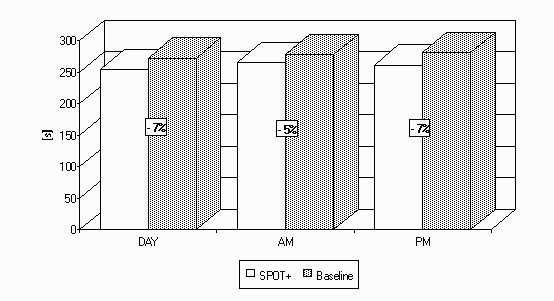
Hour        7     8     9    10    11    12    13    14    15    16    17    18    19    20    21    22    23

Base       278   278   277   269   294   278   273   280   276   270   287   285   273   271   250   243   241

SPOT+      262   268   264   259   254   254   247   246   243   245   256   263   264   257   250   245   239

% change -5.86 -3.60 -4.63 -3.79 -13.5 -8.36 -9.36 -12.4 -12.0 -9.31 -10.8 -7.70 -3.30 -5.38 -0.08  0.78 -0.46
Table 3.19: Bus Journey Time, Inbound direction
Click here for Figure 3.12.
Figure 3.12: Bus Journey Time, Outbound direction
Click here for Figure 3.13.
Figure 3.13: Bus Journey Time, Inbound direction
From the above diagrams it clear that for much of the day the inbound direction benefits from the new control strategy applied even if no bus priority measure were taken. This data confirms the private traffic data (journey time on route A) even if the effect is less marked. In the outbound direction benefits are shown in the AM peak and Off-peak periods while journey times are greater with the SPOT+ system during part of the PM peak.
The following table shows the average benefit/disbenefits introduced
during the two peaks and during the whole day.
Period       7-23        7-9       17-19

Baseline      335        346        334

SPOT+         328        334        342

% change      -2        -3.3        2.3
Table 3.20: Bus Journey Time, Outbound direction
Period       7-23        7-9       17-19

Baseline      272        278        281

SPOT+         254        265        261

% change     -6.6       -4.7       -7.3
Table 3.21: Bus Journey Time, Inbound direction
Click here for Figure 3.14.
Figure 3.14: Bus Journey Time, Outbound direction
Click here for Figure 3.15.
Figure 3.15: Bus Journey Time, Inbound direction
Stops have been recorded by moving observers on the route travelled. Thus data about stops cover only the links on the arterial.
By using the stopping rate for floating cars, the total number of vehicle stopped per peak period has been calculated by multiplying the measured rate by the flow on the link. By summing the stops on the links it is possible to work out an intersection and a network indicator.
ROUTE         A

PERIOD        AM

              entry    11 to    12 to    13 to    14 to    15 to    16 to

              11       12       13       14       15       16       17

Baseline

Trips         50       50       50       50       50       n.a.     50

Stops         23       31       41       7        25       n.a.     47

Stop rate (%) 46       62       82       14       50       n.a.     94


SPOT+

Trips         45       45       45       45       45       n.a.     65

Stops         18       15       13       2        21       n.a.     46

Stop rate (%) 40       33       29       4        47       n.a.     71
Table 3.22: Stops on the links, Route A AM
ROUTE         A

PERIOD        PM

              entry    11 to    12 to    13 to    14 to    15 to    16 to

              11       12       13       14       15       16       17

Baseline

Trips         50       50       50       50       50       n.a.     50

Stops         33       39       42       11       20       n.a.     47

Stop rate (%) 66       78       84       22       40       n.a.     94


SPOT+

Trips         32       32       32       32       32       n.a.     50

Stops         9        17       18       0        14       n.a.     35

Stop rate (%) 28       53       56       0        44       n.a.     70
Table 3.23: Stops on the links, Route A PM
ROUTE         B

PERIOD        AM

              entry    17 to    16 to    15 to    14 to    13 to    12 to

              17       16       15       14       13       12       11

Baseline

Trips         50       50       50       50       50       50       50

Stops         40       49       29       17       33       48       14

Stop rate (%) 80       98       58       34       66       96       28


SPOT+

Trips         65       45       82       45       45       45       45

Stops         45       43       48       16       6        3        18

Stop rate (%) 70       98       59       36       13       7        40
Table 3.24: Stops on the links, Route B AM
ROUTE         B

PERIOD        PM

              entry    17 to    16 to    15 to    14 to    13 to    12 to

              17       16       15       14       13       12       11

Baseline

Trips         50       50       50       50       50       50       50

Stops         47       50       30       19       34       43       5

Stop rate (%) 94       100      60       38       68       86       10


SPOT+

Trips         50       50       65       32       32       32       32

Stops         27       50       45       10       6        9        9

Stop rate (%) 54       100      69       31       19       28       28
Table 3.25: Stops on the links, Route B PM
Data on the links has been agregated at junction and arterial level using the flows on the links. Results are shown in the following table and diagram.
        AM                               PM

Inters  Baseline     SPOT     % change   Baseline     SPOT     % change


  11      3097       3426        11%       3406       2764       -19%

  12      7376       1757       -76%       7909       3739       -53%

  13      6655       1926       -71%       7324       3569       -51%

  14      1937       1584       -18%       2735       1462       -47%

  15      5824       5726        -2%       5564       6351        14%

  16      3365       3350        0%        3459       3459        0%

  17      4633       3678       -21%       4474       3000       -33%

Arterial  32887      21446      -35%       34871      24344      -30%
Table 3.26: Stops at the intersections and global indicators
Click here for Figure 3.16.
Figure 3.16: Stops at the intersections and global indicators, % changes
The benefits may be quantified by a 35% reduction in the number of vehicle stopped during the AM peak and a 30% reduction during the PM peak.
These results only consider the arterial and not the side roads but, as no coordination can be provided on the side roads due to the distance of upstream signals, they are a significant indicator of the correct behaviour of the strategy applied.
                    Intersection   11


                      Grosseto       Grosseto     Casteldelfino

                  Outb. 12 to 11   Inb. entry 11


AM   SPOT+               23            18.3           12.3

     Baseline           32.3           18.0           10.9

     % change           -28.9            0            12.5

PM   SPOT+              24.3           17.65          12.2

     Baseline           14.9            16            11.5

     % change           63.2            7.4            6.6
Table 3.27: Queues on intersection 11
As a consequence of the higher cycle time the average queue on the side roads has increased slightly in the PM peak and had a more marked increase during AM peak. Because of the low flow on the link, the changes have a very low absolute value, of the order of 1-2 vehicles. No major changes can be found on the arterial in the inbound direction, entry link for the controlled area, while the outbound direction passes from a marked reduction during AM to a significant increase during PM. This is because there is a different coordination on the arterial as the same behaviour can be found in the link journey time analysis (link 12 to 11 passes from a 21% decrease in AM to a 6% increase during PM). The absolute value for queue length however stays at a low level considering that Corso Grosseto is a four lane carriageway.
                    Intersection   15


                      Grosseto       Grosseto        Ala Sud       Ala Nord

                   Outb. 16 to 15  Inb. 14 to 15


AM   SPOT+              26.9           23.7            9.4           14.2

     Baseline           45.8           29.6            8.8           12.6

     % change            -41            -20            6.6           12.4

PM   SPOT+              34.3           28.7           19.8           15.3

     Baseline           44.9           16.4           19.9           11.7

     % change           -23.6          21.9             0            30.4
Table 3.28: Queues on intersection 15
Again because of the higher cycle times, queues on the side roads increase slightly, but not greater than 3 vehicles in absolute terms. A strong reduction in queues in the outbound direction of Corso Grosseto is noted, probably due to better management of the left turning traffic on Via Ala di Stura Sud. Changes in the coordination of the intersections, as for junction 11, result in the benefits of the AM becoming disbenefits in PM. Unlike junction 11 the changes in the average queues are not reflected in the journey times on the link.
                    Intersection   16


                     Grosseto 15   Vercelli Sud     Vercelli      Botticelli

                        to 16                     Nord 17 to 16

AM   SPOT+              n.a.           34.8            38            46.4

     Baseline           n.a.           19.9           38.5           30.7

     % change                          74.7           -1.4           51.2

PM   SPOT+              n.a.           40.3           60.25          60.6

     Baseline           n.a.           36.8           58.3           69.3

     % change                           9.5            3.2          -12.5
Table 3.29: Queues on intersection 16
Intersection 16 is the place where major changes in queues have been detected. Major changes occurred on the two side roads where, with the new control strategy, significant increases in the average queue length can be seen in the morning peak. No relevant changes have been measured in the internal link between junction 17 and 16. For the absolute values of the changes it should be noted that all the links of this intersection have four lanes so even the biggest change gives only an increase of 4 vehicles per lane on Via Botticelli during the AM peak. It should be noted that link 15 to 16 has been excluded by this evaluation due to the problems described in the introduction.
                    Intersection   17


                      Vercelli       Toscanini    Vercelli Sud      Porpora

                    Nord entry 17                   16 to 17

AM   SPOT+               8.5            12            12.9             5

     Baseline            13            12.4           13.1            5.9

     % change           -34.5          -3.3            -1             -15

PM   SPOT+              12.5           11.3           13.3            6.5

     Baseline           15.5           10.7           12.8            7.2

     % change            -19            4.7            3.9            -9
Table 3.30: Queues on intersection 17
Significant reduction of the queues occurred on Corso Vercelli Nord and Via Porpora during both peaks. No significant changes can be found on the other links. Absolute changes are not large, the biggest is of 5 vehicles on the four lanes of Corso Vercelli.
Even if significant in percentage terms, absolute changes, both for reductions and increases, have been limited to less than 4 vehicles per lane.
The predicted change in network travel time agrees well with the field trials. The field trials indicate a 10% reduction against the 9% reduction predicted by the simulation results.
For bus journey time again the improvement predicted by simulation for service 2, 5%, is very close to the average gain of 4% for both directions obtained in the field trials.
A bigger difference can be found comparing the stops indicators. The 7% reduction predicted by the simulation becomes a 30% reduction in the field trials. This underestimate can derive from two factors:
the field trials result considers only the arterial while the simulation considers the whole network.
the calculation of stops in the NEMIS simulator is very sensitive to settings of thresholds to define a vehicle stop. The definition of a stop made by the human observer may have a certain degree of uncentainty.
As the efficiency indicators of the simualtion were very close or even
underestimating the effects of the strategy it is possible to use the results
predicted by the simulations for some other indicators that have not been
measured in the field trials. If we consider the environment indicators
that strongly depend on the stop rate and the travel time it is possible
to assume that the benefits predicted by the simulations occurred during
the field trials:
| Indicator | % change |
|---|---|
| CO Emissions | 5% |
| NOx Emissions | -2% |
| HC Emissions | -6% |
| Fuel Consumption | -3% |
Journey times for private vehicles are being reduced, as is journey time variability.
Priority is being given to public transport resulting in reduced journey times, delay and journey time variability.
ATT traffic calming using a VMS and a speed enforcement camera is succeeding in reducing the number of vehicles travelling at excessive speed and is resulting in less variability in vehicle speeds. This produces compact platoons of vehicles which are more easily controlled by the new queue management strategies.
The following parameters have been studied:
Leeds:
Click here for Figure A1.
Figure A1: Time vs Distance for a set of moving car observations
Click here for Figure A2.
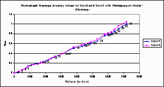
Figure A2: Average normalised time vs distance for a strategy
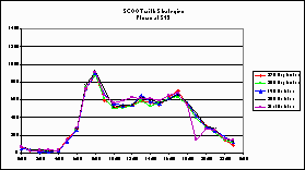
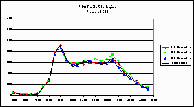
Once a complete set of data had been collected for any of the strategies, plots were made of the average time against distance for each route covered (eg. Figure A2). This allows an indication of the performance of the strategies to be determined. On its own this only shows how the strategies have affected travel times for vehicles travelling on the selected routes. We now need to try to determine how they have changed the total travel time for all vehicles using the various parts of the network covered by the routes. Data from both routes can be combined to give average travel times along each link. Flow data from the automatic traffic counts and manual classified counts can be used to determine typical flows along each link. If the link flows are multiplied by the average link travel times and summed across all the links then the total travel time for all vehicles can be determined. Obviously checks need to be made that the flows in the network have not changed significantly between runs. This can be done by examining the ATC data collected at various points around the network. Plots were made of the daily flow profiles on the days journey time data was being collected. (eg Figures A3 and A4)
Click here for Figure A3.
Figure A3: Flows at point S13 with SCOOT+ operating
Click here for Figure A4.
Figure A4: Flows at S13 with SPOT+ operating
Statistical tests were also carried out on the flows during the two hour peak periods. At most data collection points these showed no significant differences between the flows. In those cases where there was a difference it was in the flows during the baseline data collection. As the journey time analysis has concentrated on the differences between the integrated strategies and the systems without the integrated components, these differences were not important.
                           AM                                                      PM

                         Link                        Micro                       Link                       Micro

                     Baseline     SPOT  % change  Baseline     SPOT % change Baseline      SPOT % change Baseline     SPOT % change


Micro 11  Gross in     103185    97569     -5.44    361155   335222   -7.18    106041     85347   -19.52   333310   342279    2.69

          Gross out    207375   164539    -20.66                               177353    188122     6.07

          Castel.       50595    73114     44.51                                49917     68811    37.85

Micro 12  Gross in     223011   135141    -39.40    448386   224493  -49.93    237042    161249   -31.97   523511   320563  -38.77

          Gross out    211263    65180    -69.15                               259450    115294   -55.56

          Fea           14112    24171     71.28                                27020     44019    62.91

Micro13   Gross in     185483    96128    -48.17    417582   231184  -44.64    195231    128665   -34.10   485479   305781  -37.01

          Gross out    194213    87068    -55.17                               246008    123664   -49.73

          Bibiana       37885    47989     26.67                                44240     53452    20.82

Micro 14  Gross in     109199    79280    -27.40    291362   243011  -16.60    134517     72238   -46.30   396649   274885  -30.70

          Gross out    165370   131333    -20.58                               232506    154234   -33.66

          Chiesa        16794    32397     92.91                                29625     48413    63.42

Micro 15  Gross in     170389   160373     -5.88    702489   770377    9.66    116577    110985    -4.80   707643   831559   17.51

          Gross out    455593   495644      8.79                               486530    579307    19.07

          Ala Sud       33523    50150     49.60                                56004     75865    35.46

          Ala Nord      42984    64210     49.38                                48532     65402    34.76

Micro 16  Grosseto       n.a.     n.a.                                           n.a.      n.a.     n.a.     n.a.     n.a.    n.a.

          Verc. in     106404   153699     44.45    638746   737090   15.40    107284    144651    34.83   748688   817841    9.24

          Botticelli    93399   108097     15.74                                92504    135331    46.30

          Verc.out     438944   475294      8.28                               548899    537858    -2.01

Micro 17  Toscanini     44798    51891     15.83    341068   320183   -6.12     55723     59501     6.78   488736   350454  -28.29

          Verc. in     150697   115422    -23.41                               161650    106703   -33.99

          Porpora       42405    36610    -13.67                                61560     59530    -3.30

          Verc. out    103168   116259     12.69                               209803    124720   -40.55


          Total       3200789  2861559    -10.60                              3684016   3243361   -11.96
                         Hour

SIS Code       Junction    7     8     9    10    11    12    13    14    15    16    17    18    19    20    21    22    23


812 LB   180 LB   16    0.83 -18.6 -13.5 -19.1  4.82 -0.12 -1.49 -4.80 -2.59 -17.7 -6.84 -5.38  5.75  2.82 -11.3 -15.7 -13.4

850 FM   190 FM    -    51.3  27.8  17.2  9.02 34.56  29.5  38.6 34.07  8.23  25.8 34.64   148  13.2  19.2  26.5  27.6  27.6

851 LB   200 LB   15   -2.53  12.7  7.24 -2.30  2.90     6 -6.22 10.95  7.05  9.54  3.75  20.9  28.2  7.58  6.03    14  22.9

870 FM   210 FM   14   -25.3 -34.0 -36.5 -22.1  2.10 -11.9 -33.7 -24.8 -23.4 -26.2 -16.6     0 -7.36 -11.6   -25 -26.6 -29.6

871 LB   220 LB  13+12 -12.2 -11.9 -3.35 -13.5 -9.36 -8.35 -5.55 -12.6 -11.9 -11.3 -14.0 -3.79 -11.5 -8.17 -9.25 -8.28 -1.64

890 FM   230 FM    -   -13.3 -5.37 -7.64     0 -19.6     0 -29.1   -20 -19.6 -15.8 -43.5 -35.1   -34 -38.5   -40 -39.3 -42.7

891 LB   240 LB   11    22.3  11.8  23.5  5.91 48.21  13.5  17.6  17.3  21.0  15.3  7.63  28.2    40  35.1  20.7  34.1  5.26
Inbound direction
                          Hour


SIS Code        Junction    7    8    9   10   11   12   13   14   15   16   17   18   19   20   21   22   23

1644 LB  1680 LB   11     6.3  3.5  -1.  -0.  -8.  -2.  5.7  -5.  0.8  0.4  -1.  -0.  7.7  7.8  10.  9.7  12.

900 LB   1690 FM   -      -21  -7.  -13  -20  -16  -30  -36  -33  -36  -32  -29  -22  -18  -25  -31  -34  -37

901 LB   1700 FM 12+13    -10  -5.  -0.  2.6  -18  -6.  -9.  -6.  -2.  6.9  -3.  2.7  2.8  -4.  11.  24.   23

880 FM   1710 FM   -      -44  -41  -38  -39  -37  -30  -45  -46  -47  -54  -44  -36  -41  -40  -42  -46  -52

881 LB   1720 LB 14+15    1.1  2.8  2.8  2.1  -3.  -3.  -4.  -7.  -12  -9.  -9.  -7.  2.3  1.4  7.4  5.0  2.0

860 FM   1730 FM   -      -23  -19  -33  -26  -32  -26  -31  -38  -38  -37  -30  -38  -40  -38  -45  -45  -44

862 LB   1740 LB   16     -15  -1.  24.  14.  43.  29.  16.  10.  8.2   11  2.0  23.  29.  44.  48.  34.  36.
 ITS
home page
ITS
home page